|
Whitings Lager
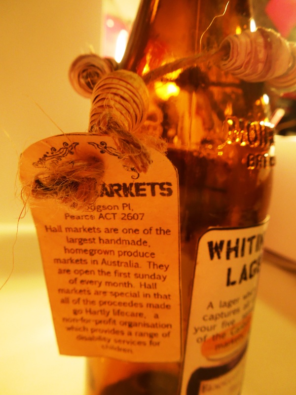
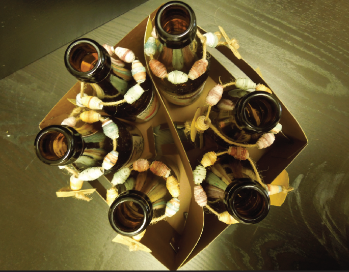
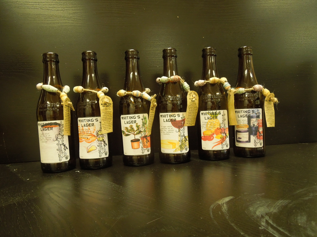
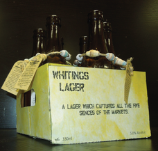
Research | Graphic Design | Packaging | Implementation This was completed at the University of Canberra in the Typography and Layout unit with Tat-Ming Yu. The brief required me to produce packaging for a Canberra brewery company 'Whitings Lager'. As a Canberra based company we were asked to design packaging which reflected the 21st century Canberra, in its most unique form. In Canberra we have the most fabulous array of local markets including the Hall Markets, Gorman Markets, Fyshwick Fresh Food Markets, Belconnen Fresh Food Markets, Marcus Clark Street Markets and of Course the Old Bus Depot Markets. I used these markets as inspiration for my design. I really wanted to capture the rawness and freshness of the markets as well as the handmade with love feel in which each of these markets encompass. I achieved this through the use of texture and colour. Each bottle has a different design on the label and showcases each market. Individual bottles have information about each market encouraging visitors and locals to visit and support local businesses. The use of the rich cardboard, rough string and handmade beads my grandmother taught me to make adds to the overall theme of raw and handmade. The packaging the bottles are nestled in is intentionally left simple to let the bottles speak for themselves. The boxes and the text are designed to reflect the style of an old milk crate, which brings out a little bit of nostalgia in all of us! |
|
|
|