|
Wattle Ways Airline
Research | Graphic Design | Branding | Promotional Items |Menu Design | Way-finding This was an assessment item at the University of Canberra. Students were asked to design a brand new ecologically friendly airline. This included the name of the airline, the corporate branding for the airline, the airlines graphics, the way-finding at the airport as well as the interior of the plane including the food trays. In the design I really wanted to reflect Australia so the use of a simple wattle seemed right. The colours are the green and gold linking to the Australian Culture as well as representing the airlines awareness of the environment. |
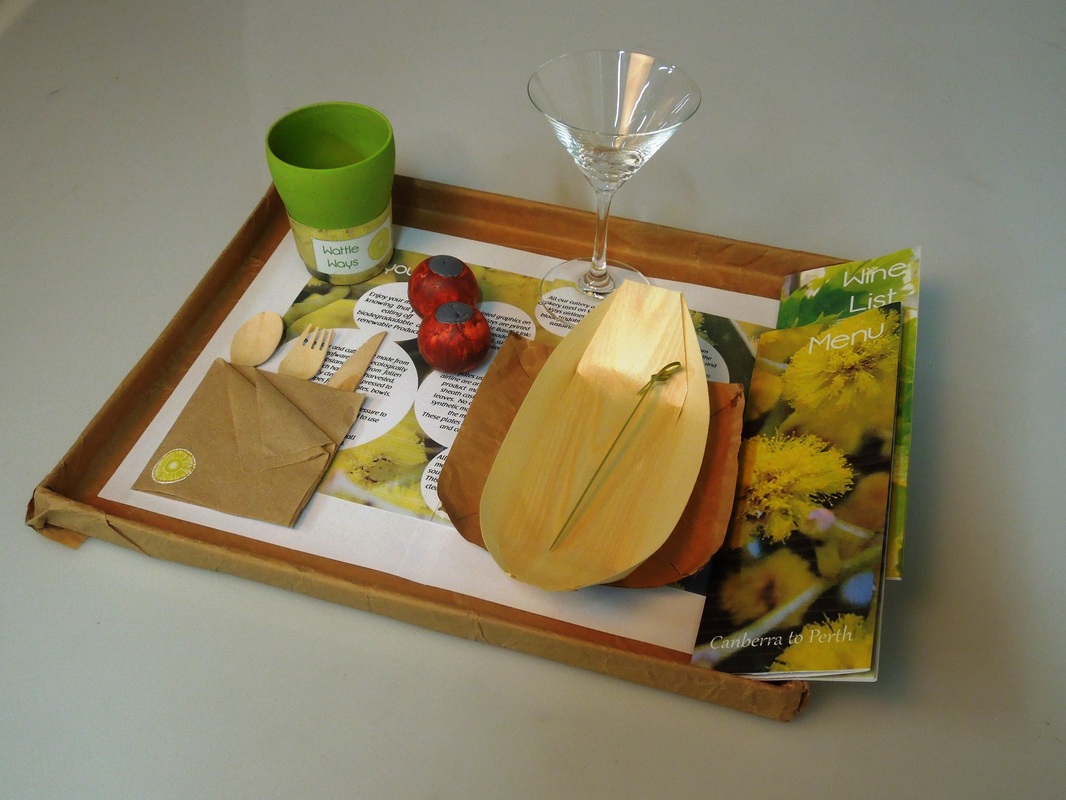
Menu Items |
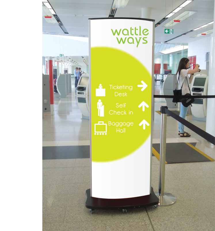
Wayfinding |
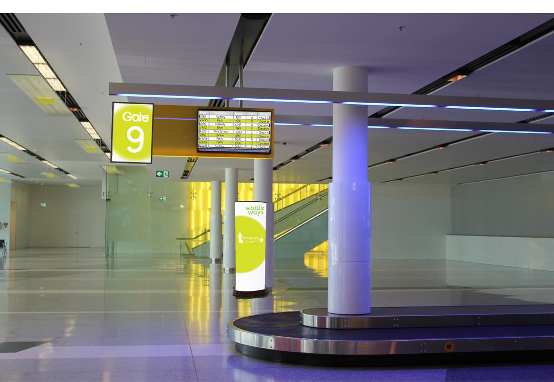
Wayfinding |