|
Sustenance
Research | Graphic Design | Branding | Packaging | Promotional Material This brief was met at the University of Canberra as part of my study. Students were asked to combine colour, symbol and text to form a unique corporate identity for "Sustenance", with emphasis on a uniquely Australian sustainable design. 'Sustenance' was a food company aiming to produce high quality, healthy Australian food for Australian consumers, with trades expanding into the global marked in the future. By providing Australians with a healthy, home grown and sustainable food option "Sustenance" helps at sustaining the future of Australia. This brand targeted at families, specifically mothers as well as environmentally aware consumers. The logo you see takes on a modern minimalist approach as to appeal to all ages not just in Australia but in the global market. The colours, symbol and text used all symbolise Australia, whether it be the rich red soil, beaming Aussie sun or the gold of our green and gold Olympic colours. These aspects coming together to create an unforgettable all Australian brand. |
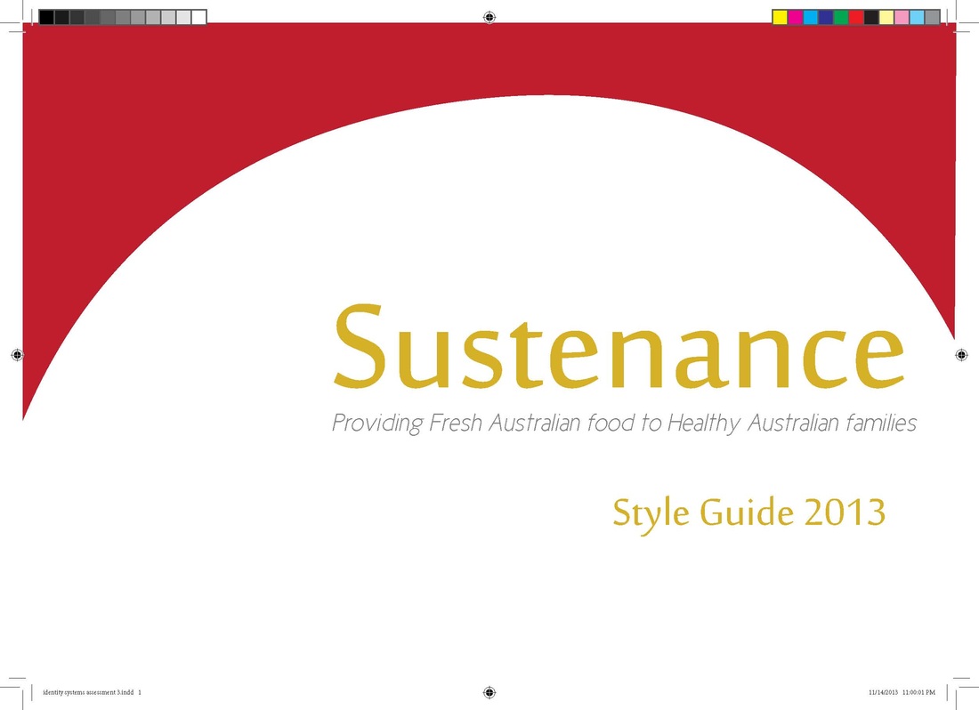
Style Guide |
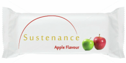
Product Packaging |
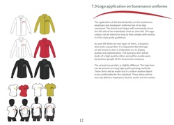
Employee Shirts prototype |